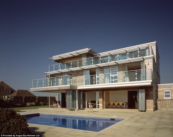
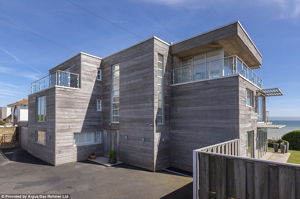
When I was reading this article about Graham Norton’s beach house, several things struck me. First of all, I marveled at how anyone would want to spend a couple of million for a beach house which overlooks the English Channel — let’s be charitable and say that it can be used as intended for about twelve (non-consecutive) weeks of the year — and for a change, one Daily Mail commenter to the article got it right: it belongs in Malibu, not Kent.

But of course, what struck me the hardest was the house’s extraordinary ugliness.

Now I’ve written before about my distaste if not outright hatred for modernist architecture, so I’m not going to repeat it here. But in this particular case, what amazes me is how little the house is part of the milieu: with only a few modifications, it would fit in quite well with similar structures on the other side of the Channel; only those were the concrete bunkers of Hitler’s Atlantic Wall, built to repel an Allied invasion of Festung Europa.
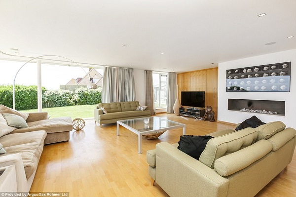
The ugliness isn’t just skin-deep, by the way: it extends to the interior as well.

Now I know that many people like this kind of interior design because it’s “clean” or something. To me, it’s not a design to live in, but meant for display — like those awful Architect’s Digest spreads which look more like museums than homes. I could no more live in such a place than in a hospital room — now there’s “clean” for you.
And yes, here comes the inevitable disclaimer: taste is a personal thing, one man’s ugly is another’s gorgeous, beauty is in the eye etc. etc. Of course it’s personal. I’m not saying that places like this should be blown up and replaced with thatched cottages.
I’m just saying I wouldn’t shed any tears over it.

I keep looking for the 88mm gun (or maybe a French 155 GPF) and the rangefinder on the roof.
The most beautiful structures are those that carefully and economically used available building materials and techniques and were built for a specific and real, functional purpose – home, cathedral, warehouse, railway station, whatever.
Buildings got ugly when construction got so cheap that any idiot could build what he shot out of his pullulating brain without suffering disastrous financial or structural consequences.
Frank Lloyd Wright’s house, ‘Falling Water’ has so many leaks that it is structurally damaged.
Personally, I like the look. Whether it “fits” or not depends upon what else has been built in the area.
As for “Falling Water”, shoddy construction trumps stunning architecture every time.
Have you ever read From BauHaus to Our House, by Tom Wolfe? It’s a history of architecture from the 1930s to the 1970s, explaining how the everything-must-be-square-and-bare “aesthetic” took over – and how much that takeover was motivated by leftist ideology. The original BauHausers were all Reds.
Ironically, it was also pushed by professional leftists – that is, Communist “agents of influence” working for the Comintern – with the intent of undermining the social order in Western countries and demoralizing the people by filling public spaces with ugly and disturbing images. A fair number of other toxic memes circulating today can be traced directly to their efforts.
Wright, BTW, was not a Modernist – they dismissed him as old and irrrelevant.
Wright had his fair share of Ego, too. I’ve been in a couple of his houses, and they are miserably cramped. They LOOK great, but once onside you8 find yourself banging against things. And FALLING WATER may look really cool, but it’s damp and noisy.
I’ve been in several post modern houses that had great interior spaces. That are wonderful…for somebody else. Me, I’m a packrat. I tend to make anywhere I live into a heap.
As to where that house belongs: I’m a fan of the “Hercule Poirot” videos starring David Suchet. The productions are all set in the 1930s (even though Christie set some of the worlds in the 1950s), and use Art Deco and Moderne locations from that period as much as possible. Poirot’s residence is set in a Moderne apartment tower. So the style has some roots in England.
Though perhaps not as much glass-wall design as here.
I like modernist stuff so long as it’s interesting– Lloyd Wright, et al. But this just looks like an ad for Ikea.
“… a hospital room — now there’s “clean” for you.”
“About that….” – Staphylococcus Aureus
And in a couple of years, it will be Graham Norton’s Former Beach House, now up for sale.
It looks like it was designed by someone whose interest in architecture stemmed from playing Minecraft.
Yeesh.
Yeah, same with cars lately. They look like they’ve been styled with the back of a shovel and an ax, then had all kinds of extraneous ridges and bumps tacked on. The interiors look like bad remakes of Captain Video control panels, and the front view always looks like a scowling face.
I’m pretty much convinced modern architects are frauds, longing for attention, so they do the design and construction equivalent of “hold my beer (white wine) and watch this shit.”
I had the misfortune to work about 15 years in an office building constructed about 1983 for $200 million that was supposed to be a building for engineering and R&D. The stupid, arrogant fuck of an architect didn’t provide enough lighting to be able to see a drawing and made no provision for connecting computers in any of the offices, among other things. Some offices didn’t even have a power outlet, but oh my it looked stunningly radical and sleekly modern. Otherwise, it was an ergonomic disaster. It’s now an abandoned building.
Wow. It’s bad enough when the building is ugly. When it’s ugly and doesn’t even serve its intended purpose?
Honestly, I think everyone is gunning to be ‘the next big thing’ in the creative fields, and that includes architecture. Now granted, ambition is a marvelous thing, but people need to remember that ‘unique’ does not always mean ‘useful’.
It’s not a building designed to last, nor one that has – or can develop – character.
I spent 14 years in construction management after earning my BS in Civil Engineering.
The word “architect” has come to mean “artist who things they can do math.” I’ve seen far too many architects try to cram eighteen feet of counters and cabinets on a twelve foot long wall then throw a tantrum like a toddler when they are told that their design doesn’t work.
I saw engineers draw mechanical lines that changed size and contents when the piping went through the floor to the next level.
I knew someone who worked at a bank. The desk folks were given “work stations” that didn’t have anyplace to store a pen or other office supplies. Most of the women at the banks in that position were women so no drawers were provided for storing pocketbooks. The architect even put a peep hole in the door to the teller area. unfortunately it was a glass door.
I’m so glad I changed careers.
JQ