And then we have this plaudit, following the Chinkvirus lockdown(s):
Shelter in place has us focused on the characteristics of a home that makes us happy. What makes us happy in a home has not changed, but since we are spending more time in a home than ever, we are focused on what makes us happy in a home. Neighborhoods become more important during shelter in place. Here is a home that exudes the elements of a home we enjoy when we shelter in place. Architect Max Levy designed this home that is immersed in nature, enjoys the shared greenways of the neighborhood, and is surrounded by vibrancy.
And this “immersion in nature” looks like this:
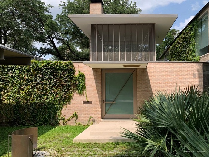
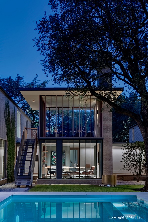
You know where this is going, right? Let’s look at the interior:
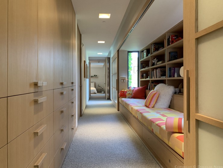
It would not surprise me if the cushion coverings were hiding concrete blocks.
This excrescence is part of a series of five houses which inspire us to shelter in place, and only one of the five does not inspire me to load up the Molotov cocktails and go for a little drive down some “shared greenways”. Here it is:
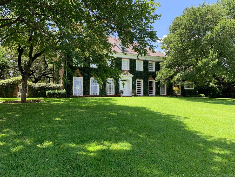
…and to the surprise of absolutely nobody, this house was designed IN 1939.
All the above are located in Dallas (not renowned for anything classical, architecture least of all), but I do know the real estate market around here quite well, and I can truthfully say that the only houses I’d consider buying in the city would be the few still standing which were built before WWII.
All the rest are either foul beyond words (“mid-century modern” aaargh ) or else ultra-modern carbuncles like the ones above. The newly-built ones, by the way, all look like they’re owned by Russian oil oligarchs, retired Cowboys footballers, Arab oil sheiks or Colombian druglords. (And that’s not just my opinion, by the way: Mr. Free Market, who has been on several tours of the area conducted by Yours Truly, has even worse things to say.)
Here’s one in Plano which exemplifies the type:
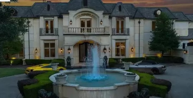
At least it looks like something a little classical. But the supercars parked oh-so casually in the driveway give the game away.
It makes me not want to buy lottery tickets, if that’s all that obscene amounts of money could buy me.

That 1st one looks like an animal cage at the zoo superglued to a bunker.
You’re in a complimentary mood today; I would have been a lot nastier.
Oooof, that first one is foul.
I love the people who extoll “immersion in nature”, it makes me want to immerse them in the nature of a several-hundred-foot-deep lake, with a cinder-block tied to their ankles. Ivy-covered walls, grass growing thru the brick patio, and cultivated ferns are not “nature”. And what the actual Hell is a “greenway”?
Fishing by the lake that’s a short walk from your home, hearing rustling in the weeds behind you and knowing there are black bears around, that THAT’S nature (it turned out to be a bird-watcher coming in, but when the weeds are higher than I am tall, you don’t learn that until he’s too close to do much except hope the potential bear is well-fed and doesn’t like the taste of shat-in-pants). Note to buttercup: in your case, immersion in nature would take the same form as the guy who communed with the grizzlies, as put SO nicely by Ron White: “Oh Daddy! You said I’d never amount to shit! Well, here I am, a steaming pile of bear shit!” Because if you’re not at the TOP of the food chain, you’re ON it.
Mark D
Timothy Treadwell. “Son, you’ll never amount to a pile of shit.”
That is not a building design that will result in “Immersion in Nature”. The indoor/outdoor demarcation is harder than anything I’ve seen in subarctic buildings. Immersion in nature requires bringing the outside in and the inside out. The jail-like second floor might be considered bringing the outside in for exhibitionists, but there’s no transition from inside to outside, and no place to eat outside comfortably.
That is an interior designed by someone who does not understand human to human activity. WHO would EVER sit at that built-in “sofa”? The “Architect” (“Home Designer”?) wanted that window, which left a wide place in the hall way, so the shelves went in, and then the “sofa”.
I suppose the architects like this sort of cubist design, I know my brother would. The volumes and massings are unmistakeably revealed in the floor plan and the elevations, but in a schematic, style-less way. At least we know who not to hire.
At least
I would have never considered putting the screened in porch on top of the house. Anything as long and bland as that hallway should have a target at the end of it but then again I’m not sure even an indoor range would make up for the apathetic design.
I’ve used a 30 foot hallway plus living room for an air rifle range, so as you say, there is that. The outside is so devoid of design or style, it might as well be an underground house. If the hallway is any indication, the interior is no better. All features, no front, no back, no vistas, no character.
Mid Century Modern — Wall – o Windows – see through houses only work well when there is enough space and woods around the house so you can’t see your neighbors …. and they can’t see you. They need lots of land (6 + acre lot)… and around here that means at least $1.5 million.
That third pic: who on Earth wants to sit on a sofa looking at a cupboard?
There’s one of those modernist houses around the corner from me. It looks awful and horribly out of place. And it’s going to look even worse when it starts to rust.
My guess is there’s a TV inside the cupboard.
First pic is the air intake and filtration house for the bunker, right?
Second pic is the cage for the kids so you get something done when you work from home. Don’t worry; the staff throws them some meat and twinkies twice a day and changes their litter box.
Third pic – nobody sits on that “couch” or whatever the fuck it is, especially since the lady of the house ruptured a disc stretching for a book from the shelves behind it…… My back hurts looking at it.
fourth pic – can I move in tomorrow?
I popped over to the link. All but the last one in red brick looked like the Prairie Architecture promulgated by Frank Lloyd Wright. In fact the long claustrophobic hallway reminds me of Kentuk Knob out in western Pennsylvania near Falling Water both FLW houses, and the “under the house” water feature is reminiscent of FW.
Here in Maryland we have plenty of houses like the red brick 1939 house of Kim’s preference except they were also built in 1739 not 1939. Oh BTW they also cost nearly $10M when they do come on the market.
They are knocking down houses in my neighborhood here in Richardson, TX and building one of two things – ostentatious and ugly mcmansions (one I call the ‘gru’ house), and those square boxes, like #1, that look like they were designed with a lego set.
One looks like a firehouse, the other a library. Neither fits in the neighborhood, both say “compound”, not neighborhood.
The mcmansions are trying to be sold for $1.2M or so. Been on the market for months.
In the early 90’s I rented an apartment in the Los Angeles neighborhood of Play del Rey. Behind us was the quintessential LA neighborhood – nice Spanish Bungalows with beautiful gardens. A couple of years ago I was back there for business and drove through the old neighborhood. It was awful. The cute bungalows are being bought by rich assholes for $millions, then knocked down and replaced with mansions that barely fit on the lots.
Kim,
This one will warm the cockles of your heart:
https://www.google.com/search?q=london+pub+rebuild+brick+by+brick&source=hp&ei=pAJaYJzUCsmvggez25LIDQ&iflsig=AINFCbYAAAAAYFoQtLcNJwwD-gNy8c2h4Fwozks-1u-t&oq=london+pub+rebuilt+&gs_lcp=Cgdnd3Mtd2l6EAEYADIHCAAQxAIQCjIGCAAQFhAeOg4ILhCxAxDHARCjAhCTAjoFCAAQsQM6AgguOgsILhCxAxDHARCjAjoICC4QsQMQgwE6CAguEMcBEKMCOggILhDHARCvAToFCC4QsQM6CwguELEDEMcBEK8BOggIABCxAxCDAToICC4QsQMQkwI6AggAOgsILhDHARCvARCTAjoFCAAQyQNQihBYoFlg72NoAXAAeACAAZEBiAGPDZIBBDE2LjOYAQCgAQGqAQdnd3Mtd2l6sAEA&sclient=gws-wiz
I hope the rebuilding bankrupted that developer.
I hope the developer bites the pillow while his/her block mates go in dry every day for the rest of his/her life.
Well, here goes. I still like Mid Century Modern.
The popular style here is simply too cluttered for my tastes. You have to move something out of your way just to change your mind !
And those 2 or 3 hundred year old houses that are sooo popular. Hope you just love maintenance, it’s costs and continual breakdowns. Why would I want to buy something that someones great-great GrandParents wore out !!?? The gingerbread alone on some houses I’ve seen would be a full time painting job for somebody !
Finally, I’ve never understood HOW one sells a house like the one shown in Plano. If I had that kind of money to spend on a house, first I would find a piece of land where I actually WANTED to live and second, go find an architect and have designed and built EXACTLY what I like and want ! No compromises, not when you get to 7 figures !!
All but #5 look like dentist’s offices.
Who wants to live in a dentist’s office.
In the “No Accounting For Taste Department” I actually kind of like the first three pix.
The ’39 “Colonial” is nice – if the interior is as “warm” as the exterior look, it would be highly satisfactory.
The more classical look is nice, but the cars belong out-of-sight at a “carriage house”.
The modern crap is just that.
Of the thousands of projects I have designed since 1972 less than 1 in 10 am I proud of. I’ve always been amazed and disappointed that the average home owner has very little knowledge or interest in what a home should be. Mostly, they want the largest for the least cost. A place to store their “stuff”, and their kids, and touch down at every now and then as the zoom about in their “busy” days.
I don’t hate all the MCM stuff, although that long hallway with the bus station bench on the right and micro-hotel cubbies on the left is a total waste. I like the idea of a presenting a strong wall to the street (and to SWAT) while opening the private side of the house to the world. But being in Dallas, I suppose those glass walls don’t open because the residents run the AC in March through October. Not exactly open to the world. If FLW were alive today, I think the combination of his shapes in harmony with the landscape and modern utilities (radiant heating, passive energy management) would have been very nice. But it would be really great if Howard Roark were real.
The fourth house looks nice. The last one is too big. The first three look like kennels that just need some newspaper or straw spread on the floor.
It’s a shame about those south west style homes in California replaced by mcMansions. They did the same to the neighborhood I grew up in except it was 1950s era ranches that were replaced with three BR monstrosities.
JQ