This is what happens when I get curious about stuff and set out to explore.
Last week, I read that former Spain- and Real Madrid goalkeeper Iker Casillas (one of the best goalies ever, btw) has divorced his journototty wife Sara:

…and moved to a “Japanese-style” penthouse in La Finca.
Where dat?
Not being familiar with Spain, I eventually found out that it’s a swanky suburb of Madrid. (I should also mention that I caught the giggles because I first read “Finca” as “Fica” — the Italian slang for “pussy” — but I recovered and went on.)
I should have stopped upon learning that La Finca was a Madrid suburb. But noooo, I had to see what it looks like. Casilla’s penthouse apartment (see here) should have given me a clue, but when I DuckDucked it, I saw stuff like this… endless examples of foul glass and concrete boxes modernity:
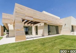
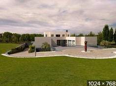


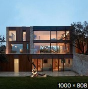
I could go on, but I think you get the drift. (If you want to see bigger pictures — gawd help you — just DuckDuck “La Finca Madrid”.)
As a rule, I quite like traditional Spanish architecture — especially the Catalonian style:


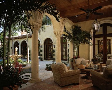
…and as for apartments and public buildings:
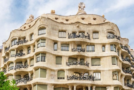
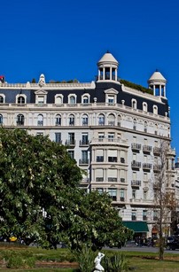
Compared to those, La Finca Horrible doesn’t even come close:

I think I need to look at something beautiful, just to recover from that hideousness. Here’s Paz Vega:

Now that’s some classic Spanish architecture for you.

I just ate, dammit!
Granted, nothing really comes close to Gaudi, but that’s just fractal ugliness right there. It’s equally hideous from every angle and at every conceivable level of detail.
Gaudi is the designer of picture #9, isn’t he? The sort of melted looking building?
Yes.
Part of Ms. Vega’s appeal for me has always been that she seems deliciously dirty in some way. Perhaps it’s because of the slutty roles she often plays. The toe ring, by the way, is usually a good indicator for the personality type I imagine her to be. Thanks for featuring her.
Spanish cities seem to have the smallest ratio of ugly/beautiful buildings, although Barcelona has some pretty weird and ugly ones.
If you want a real architectural nightmare, look up what Frank Gerhy did to the Royal Ontario Museum in Toronto. It was a classic style building, not super impressive but nice. Now it looks like its being eaten by a glass and steel alien.
Of course being a modern architect he didn’t factor in that its Toronto! and there will be ice building up on those steep steel walls hanging over the sidewalk
I looked. The architect and the board members who approved that monstrosity should be thrown through those walls, then made to sleep under them in an ice storm. What a POS. The building and its architect.
Dear God!!!! My eyes, the goggles, they do nothing!!!
I see the square boxes for houses once in a while and far more often for office buildings. They’re boring and plain with no aesthetic value. It tells me that the architect is merely an artist who thinks that they know math. 14 years in construction management and I have learned that architects are just not bright or thoughtful. Some of them have no business in the industry at all.
Some of the worst I have seen are those condo villages where every single building is virtually identical. That is probably the developer’s fault for not being willing to pay for a variety of designs for the complex or development. PIck one floor plan and make a cookie cutter development.
JQ