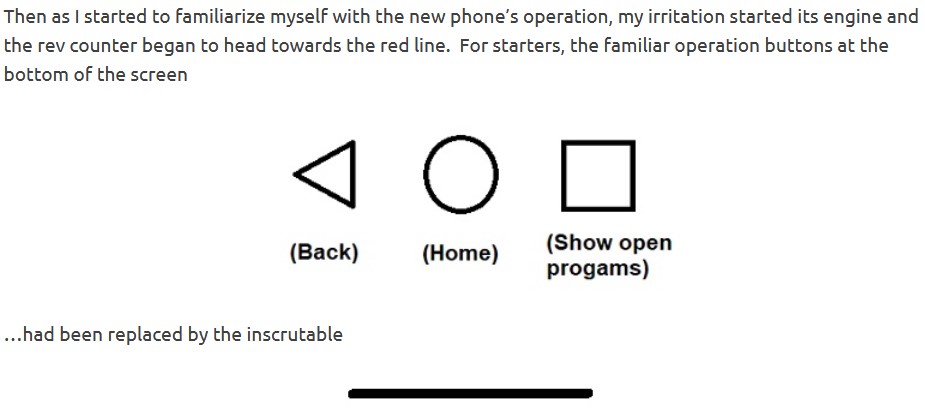
Back when I wrote about getting a new phone, I said this:

…and I bitched and moaned about that for a few hundred lines.
Well… GOOD NEWS !!!
I can now report that this can be changed, thanks to New Wife, who asked me if I’d done the latest update. Of course I hadn’t, so she gave me a gentle slap on the head and said, “Do it now.”
Okay, I can take a hint as well as the next man, so I did that with only some token grumbling. Then she said, “You’re going to love me for this.”
Gentle Readers, all is well and my equanimity has returned to only mild annoyance and irritation (my natural state). For those people who have Motorola phones or (I think) use Android operating software, the command string is:
- SYSTEM
- GESTURES
- SYSTEM NAVIGATION
- [select] 3-BUTTON NAVIGATION
…and the familiar “Back / Home / Show Open Programs” symbols will be restored.
Don’t thank me; thank New Wife.
And by the way, this option may have been available from the word go, but I never saw it and nor did New Wife. We think it was part of an update, but we can’t be sure. Whatever:


When my wife and I got new phones a couple of years ago, we found that for some reason, Samsung had decided to reverse the order. The “back” button was on the far right. I couldn’t deal with that, and quickly found the setting to put it where it belongs. Now, though, when I use my wife’s phone, I find myself hitting the wrong button all the time.
Aren’t there any UI designers out there who understand a left-to-right language?
‘Aren’t there any UI designers out there who understand a left-to-right language?’
Sure are. Lots of ’em.
Just not so much in many Asian countries where reading is right to left, therefore ……….
Ah diversity. Dontcha just love and revel in it. Spit.
Just wait till you have to figure out HOW to change your keyboard / phone / tablet from
Chinese / Japanese / Asian or Arabic to something you understand !!
I turned off all of the buttons and bars and use swipe gestures. Swipe inward from either edge = back (triangle), swipe up quickly from bottom edge = home (circle), swipe up slowly from bottom edge and hold = recent apps (square).
The “inscrutable line” makes me think of a closed mouth, which is not what Steve Jobs would have wanted.
Once again, we are stuck with trying to get into the mind of the &*^@#$$% programmer to divine what in the hell he (usually, but not always) thought was so supremely self evident that no explanation was necessary in any of the papers sold with the device.
https://www.youtube.com/watch?v=JI1ivqnFkHc&ab_channel=TabernacleChoiratTempleSquare-Topic