Gratuitous Gun Pic – FN Mauser 24/30 (7x57mm)

It occurs to me that we haven’t had a decent pic of a gun on this here website in ages, so without any more to-do, here goes:

Like the similar-but-not-identical Czech Model 1924, the Mauser 24/30 rifle was made for the Venezuelan army by Belgium’s Fabrique National, and not by Mauser (the Germans having been banned from making weapons for being Very Naughty Boys between 1914 and 1918).
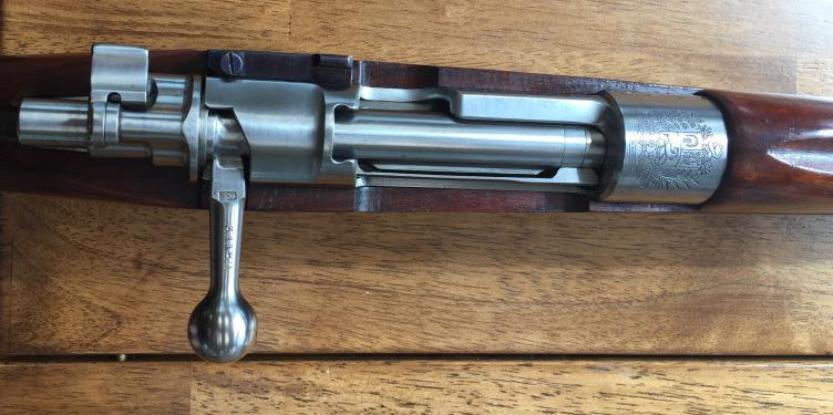
I’m not going to go on about the gun’s history — between Othias, Mae and Ian McCollum, the topic has been extensively covered — but what I am going to go on about is the rifle itself, and its cartridge.

I happened upon one of these beauties at a local gun parlor, and were it not for the fact that I had only the budget to buy Daughter her carry piece, I would have walked away with two guns that day — a not-uncommon occurrence during Times Of Plenty back then.

If you can find one in  minty condition, this is not a rifle to be left on the rack.  The action is (duh) Mauser 98, the chambering is for one of my favorite cartridges, and were I to see that same one right now, I would sell a child or something to get it.   Here’s a comparison of like cartridges:
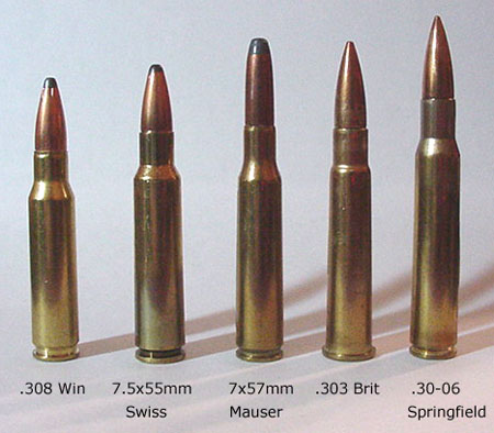
…and you can see that the 7x57mm is different from all the rest in that it has a long, thin bullet which provides excellent penetration.  This, lest we forget, is the same cartridge which kicked the .30-40 Krag’s ass during the Spanish-American War, and pushed the U.S. Army towards the .30-06 Springfield as a replacement.

I like the 7×57 because its recoil is relatively light, although I will also concede that it’s not the flattest-shooting cartridge past 200 yards.

But for an all-purpose rifle that can handle most small- to medium game and errrr two-legged targets with the same effect, you could do worse — a lot worse — than have one of these in your safe.

Accursed Menus

Here’s a rant after my own heart:

I was puzzled, so I checked the website and got nowhere. The password I’d used for the account was suddenly not accepted.
So I phoned the number on the website. And got nowhere. This time the problem seemed to be my PIN.
Or maybe my account number. Or maybe my customer ID. Or my PCN number. Whatever that was. The recorded message didn’t really care. I gave up.
I had become the innocent victim of the new digital age in which the algorithm reigns supreme.
There was a time when a human being with a problem talked to another human being who helped to get it sorted. Those days are gone.
The lives of big companies and government officials are made so much easier if we customers or clients can be kept at arm’s length.

The online experience is bad enough — but when you dare to call the “Customer Care” (ha!) telephone number, that’s really when the SHTF.

A combination of the two above means that I will be changing my Medicare supplemental insurer, because it seems to be the only way I can punish these assholes for their bovine indifference to my situation.

I’ll let Humphrys finish this rant:

Increasingly, we are being deprived of even a semblance of what we once thought of as customer service.
We are left talking to a computer screen behind which sits not another human being, but an algorithm. Or a recorded telephone announcement that may or may not respond to our pleas for help.
It’s as though any human compassion in the relationship between customer and provider has simply disappeared. And that’s very sad.

Or enraging.  Ten guesses which side I’m on.

News Roundup

Bringing you the usual mix of pointless, stupid and crappy stuff.  Also the sorta-news.


key word:  India.


the difficult part is not involving Hillary Clinton in the process, because no one will believe a Kamala Harris suicide.


just wait till they actually get to see some.


Rope.  Tree.  Nadler.  Some assembly required.


not nice to refer to our beloved FBI as “tools”, but here we are.

And a few headlines from the department of :

not to mention that it makes them think of eeeevil guns.


all the hundreds of Nazi-loving actors who ever played Hitler could not be reached for commentBest part:  Mirren is a howling Lefty.


good.  Let’s go back to calling them perverts. sickos and Clintons.


how about:

too strong?

And in an unusual display of common sense:


next on the list:  Afghans, now that the Great Satan is no longer in their country and peace has been restored.


what he said.

Time for INSIGNIFICA:


actually, there’s no “could” about it.  As the holder of a foreign title, Markle is Constitutionally prevented from being PresidentLOL.

Finally, from a hardworking wife and mother:


…and because:

…here ya go:

Hey, for a quarter-million bucks a year, I’m just surprised there aren’t more of them.  Or maybe there are, but how would I know?  (I feel a spin-off post coming…)

Monday Funnies

And seeing as it’s the first Monday after our high holy day (National Ammo Day), let’s alleviate the Monday Blues with the following:

…which will henceforth be the logo of our Righteous Shootings posts.

And lastly, in the spirit of the above:

Now go and cook your breakfast meal.

The Problem With Jaguar

In yesterday’s post (), I said that I disagreed with Frank Stephenson’s Top 3 choices of outstanding Jaguar design (and if you haven’t read it yet, you should because otherwise a lot of which follows may not be understood).

“O Kim,”  I hear you saying, “who are you to argue with the design choices of an actual car designer, you ignoramus?”

As with all things, it comes down to categorization.  So let’s look at Stephenson’s Top 3 Jaguar designs:

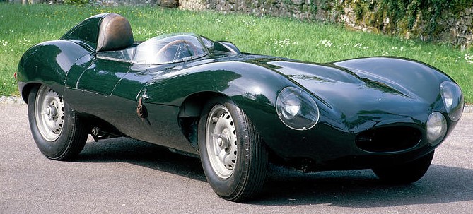
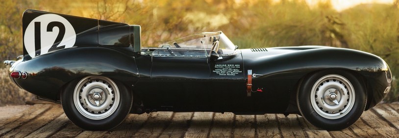
1) 1954 Jag D-type:
 

Is it jaw-droppingly gorgeous?  Hell, yes, and sexy withal.  But the problem was that it was designed as a race car — a track car, and therefore made in tiny quantities (which is reflected in the prices asked for each of the two dozen or so still known to exist).  But I think the D-type is more important for what it did to Jag’s production sports car line which followed, and you all know where this is leading:

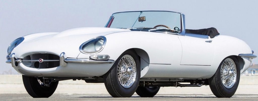
And as much as I like swoopy curves, I think the E-type is the design which not only set Jag apart, but caused others to try to copy its appeal in their cars, and failed.

To be fair, Stephenson does think that the E-type is the greatest car design ever, and I’m not sure that too many will disagree with him.  But I think he did it a disservice by excluding it from his Top3 Jag designs, putting in instead the earlier D-type racer.  Now did the D influence the E?  Undoubtedly;  but the E-type is still the superior design.  His next choice, though, cannot be questioned:

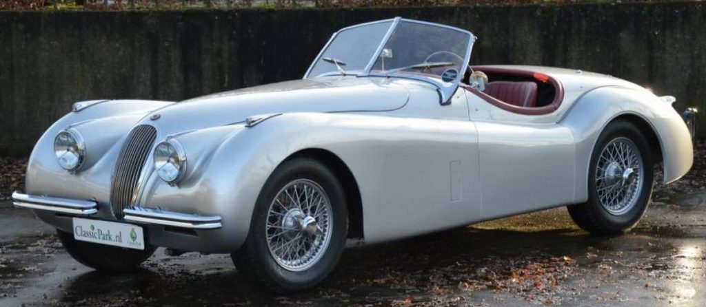
2) 1950 Jaguar XK 120 OTS

If you were to rebuild an exact replica of this car, modernizing only the electro-mechanical shortfalls of that vintage, there is not a man (nor maybe woman) alive who would turn it down if parked in his driveway as a gift.  It is unmistakably a Jaguar, undoubtedly a classic, and irrefutably the supercar of its time.  Its design would set the standard for Jaguar for a decade or more.

Finally, we come to Stephenson’s last choice:

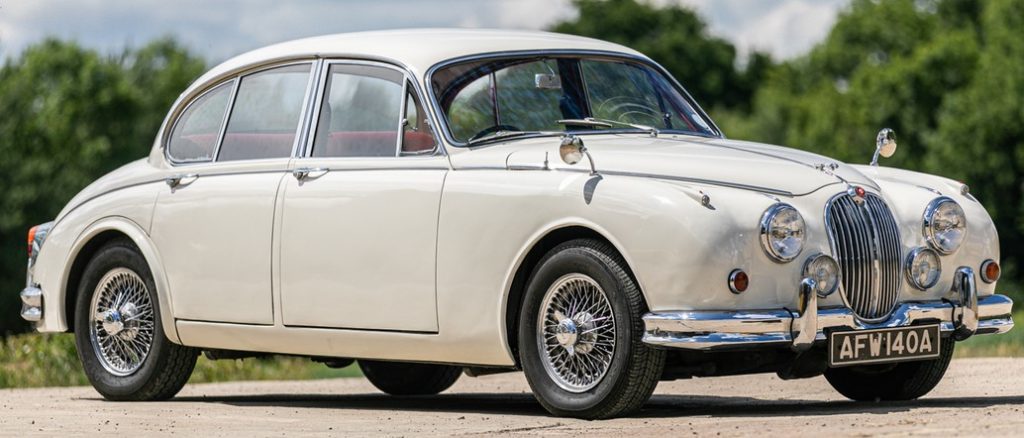
3) 1955 Jaguar Mk 2

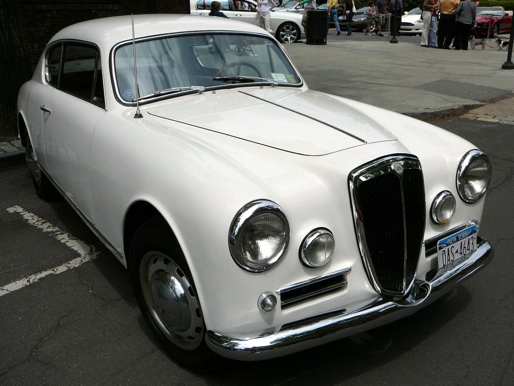
I’m not going to argue with this choice too much, because it was a good design — for Jaguar.  Unfortunately, there were also more than a few cars around at the time which looked quite like it, e.g. the Lancia Aurelia:

Honestly, if we’re going to look at an excellent Jaguar design perhaps worthy of a Top 3 position, we need to consider this one:

1969 Jaguar XJ6

Over the next four decades, every single new XJ passenger car model flowed from this design, and like all the classic Jaguar designs, it was all about what Jaguar represented:  understated, classy, yet with a hint of snarling power waiting to be unleashed.

So there you have my choices:  the E-type, the XK 120 and the XJ6.

Feel free to discuss in Comments, as always.

Top 3 Designs

Not mine, this time, but those of a guy named Frank Stephenson who, it must be said, is a bona fide  car designer and not just some guy on the Internet with an opinion — that would be me, among so many others.

Like me, though, Stephenson seems to favor cars designed in the pre-wind tunnel era — and certainly his design of, for example, the Ferrari 430 bears that out, even though he never actually admits it as such.

Anyway, our Frank opines on several brands’ designs — designs which he feel are statement cars and ones which either set, or reshaped the manufacturers’ designs for years to come.

Amazingly, though, I am in agreement with a lot of his selections despite my being a total amateur in this field.  His take on BMW’s three best designs are spot on, for example — the M1, 507 (which are my top pair, as you may recall) and the E9 / 3.0l CSi (which would be my number 3 choice, by the way).

I don’t agree with all his Ferrari choices, though.  Of course I agree with his selection of the Dino 246 GT and the 1960s-era 250 GT Lusso, but not so much with the 1970s 365 GT BB (which was really just a knock-off of the Lambo Miura P400 — as Stephenson himself acknowledges).  From a pure design standard, I would have picked one of the Scuderia’s other offerings, although which one I’m not quite sure.

Anyway, here are the episodes I think are interesting:

So kiss your Saturday goodbye, and if yer Missus yells at you, blame me.  I’ll be talking more about this topic tomorrow.