Here we go again, with some egotistical asshole disfiguring the world with his “art”:
Vincent Van Gogh loved the light in Provence so much that he moved to the southern French city of Arles in 1888 for one of the key years of his short life. So how fitting that a new building, which dazzlingly reflects that light, has made Arles a major centre of contemporary art. Called Luma, it is designed by Frank Gehry, famous for his Guggenheim Museum in Bilbao, who took inspiration from Van Gogh’s famous painting The Starry Night.
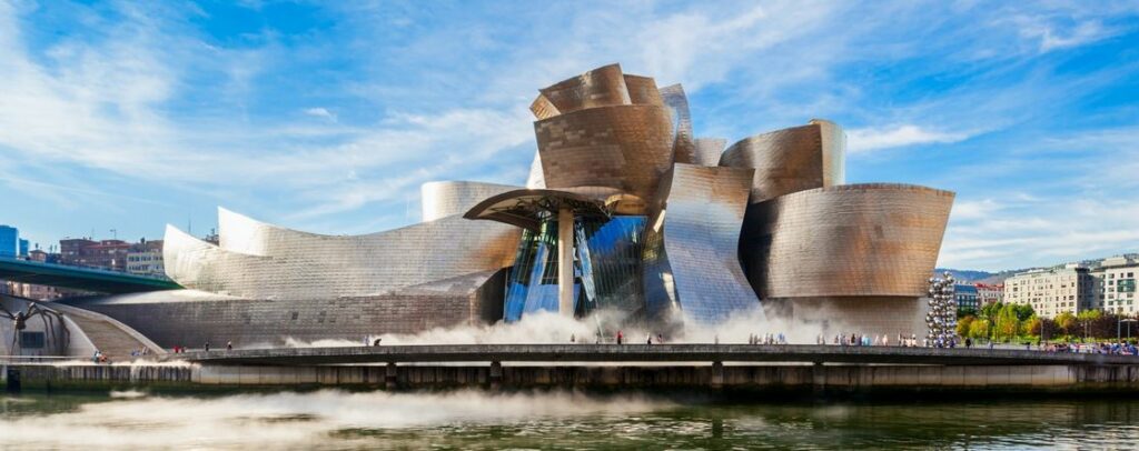
Given that Bilbao’s Guggenheim looks like a giant burst carbuncle, we all know where this one’s going:

Even worse than this, of course, is that a group of Bilbao’s city “planners” looked at the drawings and model of this disgusting excresence and said (in Spanish): “Oh wow! This is just what we need to make our city look more artistic!” and signed off on the hideous thing.
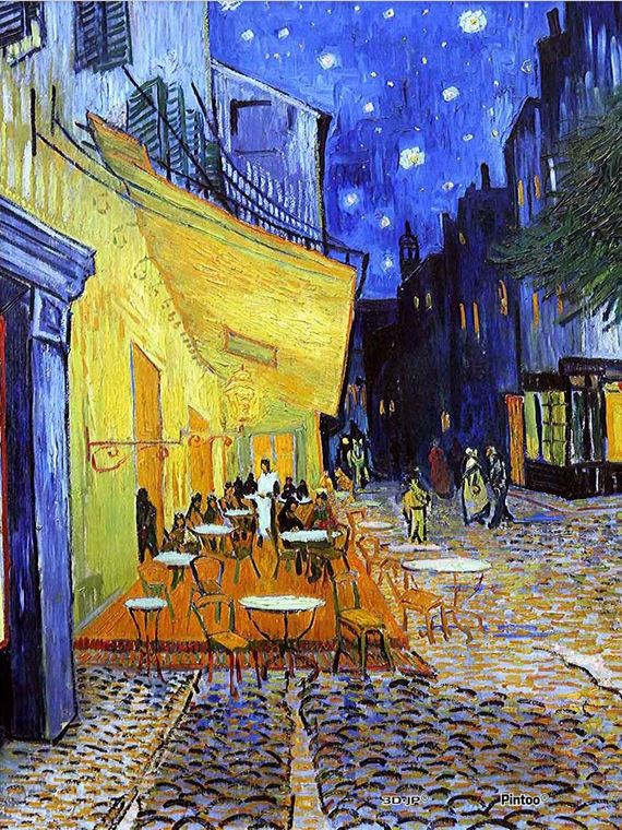
But returning to our story, here’s Arles, as seen by Van Gogh:

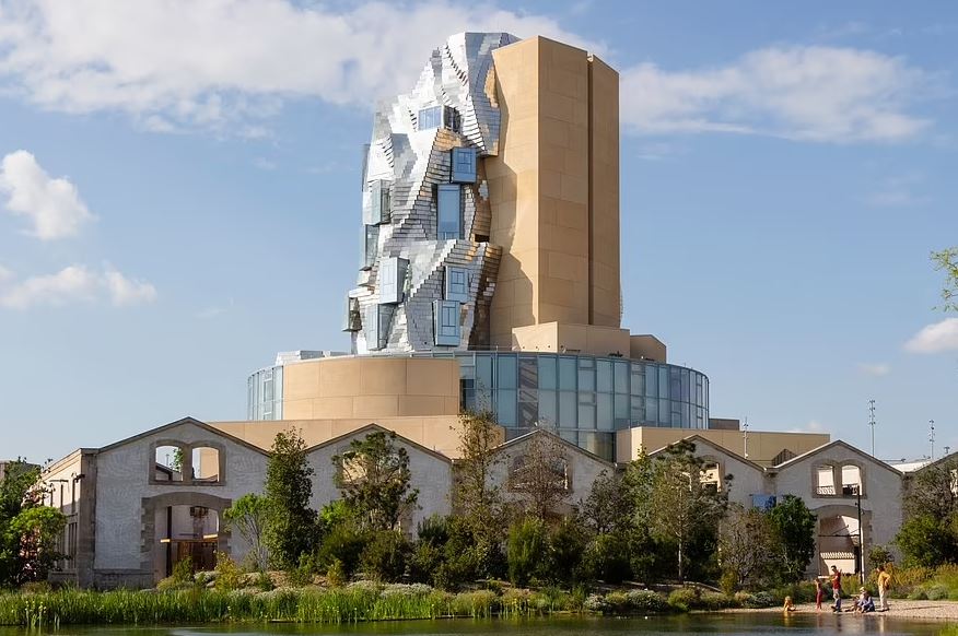
And this maniac’s vision for Arles?
And it’s quite a sight: a ten-storey tower made of 11,000 twisted stainless steel panels, glass and concrete dominating a huge £150 million ‘creative campus’ on the site of a former railway yard.

They should have kept the railway yard. From the genius himself:
Gehry says his Luma design was influenced not only by Van Gogh’s The Starry Night but by Arles’ Unesco-listed Roman heritage as well.
Yeah, nothing says “Roman” like twisted steel and glass.
If this distorted dildo had been around in Van Gogh’s time, we’d at least have one good reason why he cut his ear off. In fact, he could have cut his eyes out, just to avoid looking at it.
And if Starry Night makes you think of things like this, you need a psychiatrist more than Vincent ever did.

Gehry wads up a gob of aluminum foil and throws it in the corner. Then he calls in his head designer and says, “There’s your new project, make it so.” Gehry’s projects are notoriously expensive and always over budget because every single component is custom made. It is not possible to know in advance what the end result will cost. Also, the time factor and scheduling is skewed heavily because of this, which also costs way more money. There’s a reason why Gehry’s biggest projects are for gov’t’s with bottomless barrels of stolen money. Normal people shun Gehry because reality has to keep 1 foot on the ground at all times.
Adding to the cost of custom components, is the tendency to design projects without regard to how they will actually stand up or be constructed. Not only do most Architects depend on Structural engineers to bail them out of the corners they paint themselves into, they then insist that the interiors feature things like curved staircases without visible means of support. Large open interior spaces where columns and beams need to be, all the while assured that “the engineers will fix it, but I’ll get all the credit for a great design. ”
Who… me bitter?? No, I got paid.
Frank Lloyd Wright was infamous for buildings that looked good…but were structural nightmares.
Yes, the way Gehry works is to design the exterior, then he turns it over to the structural engineers to figure out how to hold the damn thing up. Poor bastards. I wonder how long they last on the job. I hope they get out before they need psychiatric help.
Poor Arles.
It’s one thing to have so little artistic talent that all you can come up with is a modern art architectural debacle… but to blame it on a great post-impressionist painter like Vincent Van Gogh (who cannot even defend himself) this man deserves to be tarred and feathered.
It’s like the building got the same kind of tumors as The Elephant Man, but the tumors came from an invasive species of intergalactic cyborgs.
My personal bet is that, in order to create the ‘interesting’ shape of the exterior, the spaces inside must have more than their fair share of useless nooks and impossible bends.
My late MOTHER was an architectural historian by avocation, so I grew up with a more critical understanding of building design than many. The ‘Moderns’ (not so modern, now, they got their starts before the World Wars) threw out hundreds of years of experience and practice to ‘start from zero’. It sounded brave as heel. It has produced generations of buildings that a little thought about tradition could have predicted would be borderline unusable.
One of my Mother’s favorite stories concerned a new ‘Arts’ building for a University campus in Massachusetts. The Arts department had a long list of necessary features (wide stairwells for large canvases, wing and fly space for the stage) which the architect TOTALLY ignored, and the oversight committee failed to catch. The Arts department HATED the result, which was nearly useless. It burned down in fairly short order, and the only people in the State who didn’t think it was arson were the arson investigators.
One of the requirements the architect had ignored was well ventilated storage space for volatiles like paint and turpentine…
“… which the architect TOTALLY ignored, …”
Had to live with that for 15 years. Our $200 million 1982 office building won architectural ‘awards’ – no doubt from fellow egomaniacal architects – but was an ergonomic disaster.
The building was for engineering and R&D, yet there was no wiring provision for neither mainframe dumb terminals nor networked PC’s, utterly inadequate illumination to read text or view engineering drawings, no electrical outlets for cube offices, a V-shaped roof that ended in a central valley that leaked rainwater so badly into a 60′ high, 100 yard long atrium that there were about 15-20 white five gallon buckets lined up all along the leak line every time it rained.
There were lots more things that made us miserable, from malfunctioning, unworkable technology, to nightmare internal traffic problems and dead, useless spaces, but enough. You get the picture.
Our architectural committee caught all this ahead of time, but when potential problems were noted in meetings, the asshole architect would bang his fist on the table and scream at the committee “You people are not going to fuck with the integrity of MY design,” and run off to whine to our Manhattan-based executive VP, and of course being Manhattan where they know better than us proles in the hinterlands, the architect got his way. That arrogant POS even had a no-cut contract where we could not even add a desk lamp or buy a stapler without his approval of the design for seven loonnngggg years. The place was a fucking nightmare to work in, and was emptied and put up for sale at about age 20. No takers now in the 20 years since; I guess it will be demolished one day, as it should be. Sadly, given the horrendous modern eyesore apartments and office buildings being erected all around our area now, it will be replaced by something equally bad or worse.
I’ve been to Arles, for an afternoon. Wish I could have spent more time there; it’s a lovely city. Visited the colosseum and took in a bullfight (kind of grotesque, but then again it’s not part of my culture).
Lovely dinner before heading back to Villaneuve-Loubet. I wish I could remember what we had.
How did he get the job, well it’s not what you know, it’s who you fuck.