I’ve ranted so often about shitty architecture on these pages that one might be forgiven for thinking that I’d be sick of it by now.
Silly rabbit.
Here’s the latest example of foulness:
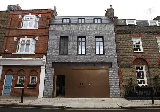
Residents living next to one of the most expensive houses in Britain have blasted the home as a ‘monstrosity’.
The newbuild, in the exclusive London suburb of Chelsea, has been nicknamed ‘Gucci House’ by appalled neighbours because of its ‘gaudy’ appearance.
The ‘ugly’ mansion occupies land that was formerly a school playground and has a dark grey exterior and imposing metal gates outside.

The exclusive street is the oldest in Chelsea, dating back to at least 1566.
I know, it looks like a wart on a pretty girl’s face — not, mind you, that London residential architecture is anything like a pretty girl’s face: it’s dated, and occasionally quite horrible — but whatever, it’s what gives London its character.
As to why some rich fuck and his equally-fucky architect would want to lessen or destroy that character, I leave it to you to decide. But speaking of that architect, here’s a quote which describes the process perfectly:
Original architects, Gumuchdjian, describe the property as surrounding a garden courtyard with an entrance that echoes the Parisian Hotel Particular.
Okay, let’s just nip this little turd-piece in the bud.
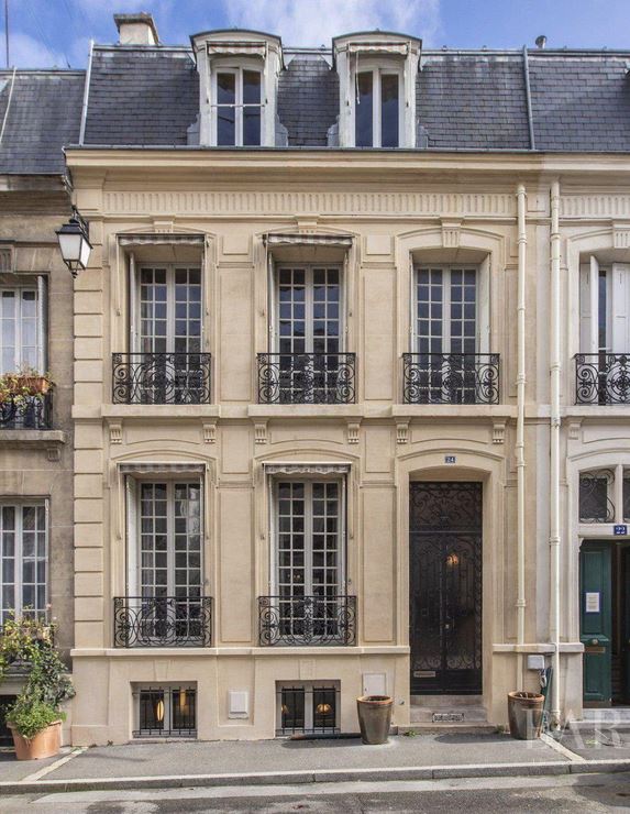
There’s no such thing as the Parisian Hotel Particular — it’s not a specific building, so it shouldn’t be capitalized. The hotel particulier is a style of building, and denotes a grand townhouse. Here’s a typical example of said style, in Paris:

To even suggest that this London carbuncle resembles the above is mendacity in the Clinton Class.
And here’s the final word on this catastrophe, from a neighbor:
‘My house has survived The Blitz, it was built in the 1780s, they’re not building to match the heritage of the area. It’s like vandalism. How can the council approve this when it doesn’t match the other ones?’
Here’s a clue:
The house changed hands just last year and according to data from the Land Registry, the price tag of £73.2million was 209 times the average house price last year which was £350,396.
When a house costs about $100 million, a hundred thou or so to the right councilor or planning authority is small change.
Just sayin’.

The article shows the rest of the house which is straight out of Modernist Architecture school, and I’m guessing the street facade was to hide it. “It looks something like the rest of the street” so the neighbors can’t complain like they would, had we continued the interior to the street.
Imagine that you spent a lot of money building a place you like and your neighbors start complaining that they don’t like it.
What if they start complaining about what you eat for breakfast, or the car you drive, or the shoes you wear, or the guns you own?
Where does it start and end?
I’ve been practicing architecture professionally since Jan 1972 and there is no shortage of people that don’t know their ass from a hole in the ground. Seriously, for being the most expensive thing they will ever own, 99% of the owners are unbelievable ignorant about them and even worse, they don’t care.
But they sure do care when they perceive their neighbors spent more money on their home than they did. School gurl jealousy and simple minded.
I think you’re missing the point of a “neighborhood” — i.e. being part of a group of like-minded souls. Nobody’s suggesting slavish conformity, here: just a respect for heritage. Elsewhere, the wonderful London skyline of Big Ben, Tower Bridge and St. Paul’s Cathedral has been forever altered by the insertion of glass-and-steel skyscrapers; not for nothing do people now refer to it as “Dubai-On-Thames”.
As for the street in Chelsea: it’s your opinion, of course, and you’re welcome to it. But you’re quite wrong.
Since that home is in fact in a “neighborhood” there is the strong suspicion that the legal authorities required that building and perform to look the way it does. Don’t under estimate what those tyrants are capable of, and it doesn’t have to make sense.
Currently I have 3 separate building designs I have been trying to get through the building and zoning depts in southwest Florida since June of last year. The level of rules and regulations and codes, etc., is unimaginable. Frankly, this series of projects may break me, and at age 69 I am considering actually retiring, or at least finding something else to do.
The good modern architects do have it difficult to add style and charm in designing a residence functionality (instead of, as the tract home guys do, conserving materials to a fault, even builders grade). To your point: Local “authorities” and code have gotten so stupid that it drives the cookie-cutter garbage that is [mostly] about the inside spaces and driving inhabitants behaviors (porch pushed back, upfront garage sticking out …put the friggin garage in the back or side, heck, an alley accessible garage had charm and separation, not just a layer of 5/8” sheetrock). Not to go one…b7t your point is well taken, as the good architects toss in the towel from The Idiots in Charge forced constraints. You get this (post) garbage.
I’m with the neighbors. And all it would have taken was a brick color and styling on the front that is consistent with, or compliments, the surrounding buildings. A simple thing. But the owner wants to shout “look at meeeeeeeeee!!
Not quite “hideous,” but I get the neighbors’ complaints.
Let’s face it: much of modern architecture, especially public buildings, is hideous. Brutal concrete monstrosities. Ugh.
With the limited view, the only thing the neighbors really have a reason to gripe about is the color of the brick, and the “imposing metal gate”.
The brick is a legit complaint. A year or two a go a house I walk by with Dog every so often was painted in the colors of the local sportball team. Neighbors were *pissed*. The owner had it repainted, and it’s a little better. But really, if the architect and the original owner had a lick of common courtesy they’d have picked a shade of brick in between the houses to the left and right, or at least something similar.
The iron gate OTOH…this is London. If I lived in *any* big city in 2024 I’d want a pretty resilient gate between me and the mob. A soild metal gate like that is even better because it doesn’t let the mob see what is parked behind it.
…and the fact that it looks like a warehouse would make the mob even more curious to see what’s behind its gates.
.
X2
That is hideous, and so typical of todays tone-deaf self-absorbed owners and their architects where money is no object and shouts “look at me”. Today’s architects all think they are Frank Lloyd Wright…they are not (look at any Gehry design, idiotic, expensive to construct, and lousy functionality). The Chelsea neighbors should have screamed louder.
Where was the local historical committee or permit office architectural review? Maybe they got paid to look the other way. Contrast that with Jeremy Clarkson being forced through hoops just for a farm stand and open air restaurant on his large farm property, that benefitted the local farmers and community…those got serious pushback from a handful ninny’s who simply didn’t like him, yet prevailed (well, S3 should be interesting on that front…there are always workarounds).
I saw a quote somewhere in a book that either some French Modernist Communist architect (redundancy alert) or the founder of the Bauhaus Movement (more redundancy) said, “To make something deliberately beautiful is a terrible thing”. Well they have succeeded in avoiding such terribleness.
The neighbors, being pretty well off, should be able to rent a crane with a wrecking ball. It could be a real fun night.
Failing that (streets too narrow?) perhaps they could rent a howitzer for the King’s Birthday or something.
That gray turd is an abomination to the eye and the human spirit, and sadly, closely resembles the apartments/condos starting at $500K and up springing up around here by the thousands. Views of our once scenic riverfront are blocked off from the land side, and the once beautiful landscape views from a canoe on the river are now stained by these five and six story splatters of scrapyard shit.
They are so depressingly sterile and off-putting that stacks of recycled shipping containers in their place would be an upgrade.
Worse than the exterior trim (because that’s all it really is…ten years from now you could face-lift the trim to make it look like the neighbors) is the fact that it’s a “snout-house”. You know, a building on which the garage ate the house. We see it all the time, where a million-dollar house looks like garbage because the entire thing is fronted with a three-car garage that dominates the front.
I love detached garages from an engineering standpoint since you do NOT have a demising wall between your vehicles, stored flammables, and other assorted stinky/dangerous stuff, and the place where you live/eat/sleep. You don’t have to worry about a fire starting in the greasy rag with which you wiped off your oil plug and spreading to the house in the middle of the night.
The problem with this house is that it’s going to be extremely difficult in the future to hide the monstrous garage door. Putting on a new facade on the building will be straight-forward, but they’re going to have to get very inventive with that door…maybe build a custom door with two or three full-length windows and associated trim or something.
Who in their right mind would pay the equivalent of a hundred million bucks for that thing?