Cue The Dynamite

Here we go again, with some egotistical asshole disfiguring the world with his “art”:

Vincent Van Gogh loved the light in Provence so much that he moved to the southern French city of Arles in 1888 for one of the key years of his short life. So how fitting that a new building, which dazzlingly reflects that light, has made Arles a major centre of contemporary art. Called Luma, it is designed by Frank Gehry, famous for his Guggenheim Museum in Bilbao, who took inspiration from Van Gogh’s famous painting The Starry Night.

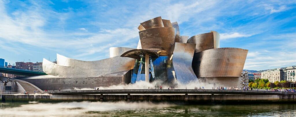
Given that Bilbao’s Guggenheim looks like a giant burst carbuncle, we all know where this one’s going:

Even worse than this, of course, is that a group of Bilbao’s city “planners” looked at the drawings and model of this disgusting excresence and said (in Spanish):  “Oh wow!  This is just what we need to make our city look more artistic!”  and signed off on the hideous thing.

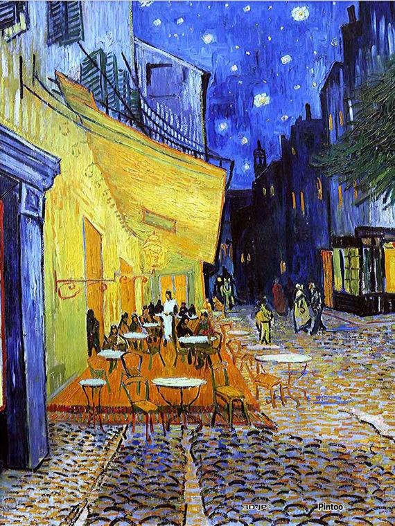
But returning to our story, here’s Arles, as seen by Van Gogh:

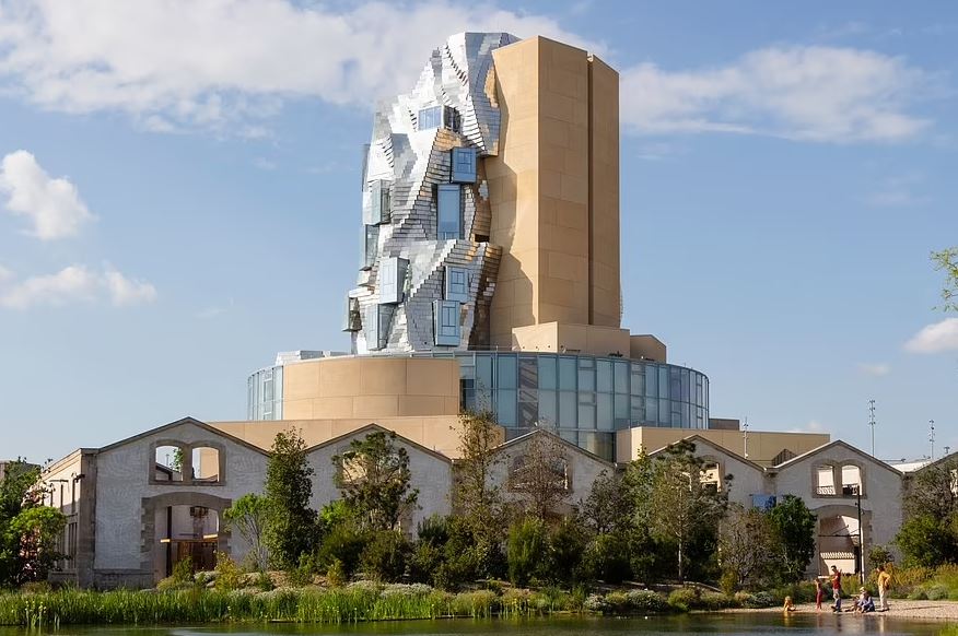
And this maniac’s vision for Arles?

And it’s quite a sight: a ten-storey tower made of 11,000 twisted stainless steel panels, glass and concrete dominating a huge £150 million ‘creative campus’ on the site of a former railway yard.

They should have kept the railway yard.  From the genius himself:

Gehry says his Luma design was influenced not only by Van Gogh’s The Starry Night but by Arles’ Unesco-listed Roman heritage as well.

Yeah, nothing says “Roman” like twisted steel and glass.

If this distorted dildo had been around in Van Gogh’s time, we’d at least have one good reason why he cut his ear off.  In fact, he could have cut his eyes out, just to avoid looking at it.

And if Starry Night  makes you think of things like this, you need a psychiatrist more than Vincent ever did.

Unwanted Feature

Here’s another thing about this so-called “Modern Lifestyle” that is a stone in my soul’s shoe:

A SUPERYACHT owned by a Russian tycoon boasting an eye-watering £61million price tag is set to be auctioned off after being seized.
The stunning 240ft vessel – named The Axioma – has a catalogue of bougie features including six decks, a pool with a swim-up bar and even a cinema.

What is it with having an in-home movie room these days?  You can’t open a real estate listing without seeing a windowless room with a giant screen and a few overstuffed easy chairs in it, and if I ever bought a house with such a “feature”, all that crap would be tossed out and replaced with something of redeeming social value — like a tasteful, fully-stocked bar — before the ink was dry on the closing documents.
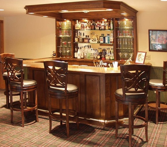
Here is where I could hang out with a few friends, enjoy good fellowship, conversation and companionable drunkenness, all in a friendly setting.  Maybe a TV screen in the corner so we could catch a decent game or a Grand Prix maybe, but live sporting events are different from movies, as a moment’s thought will prove:   they are definitely group entertainment.

Movie houses are, almost by definition, not a place for gathering and social interaction.  Oh sure, you enjoy the movie “experience” together (not that too many modern movies actually provide much of an experience, don’t get me started), but that’s it.

“Oh, but Kim,”  I hear the cry, “it’s really a place for your teenage kids to hang out with their friends.”

Yeah, I really want my teenage daughter hanging out in a dark room with her testosterone-laden boyfriend, with the sound turned up loud lest parents actually hear what’s really going on in there.  Or if there’s a whole group of them, to be greeted by a sea of thrusting pimply adolescent backsides when I walk in the room.

Okay, enough of that.  Or if not a bar, then a gun room.  Yeah, a wall full of cabinets such as below, inside a securely-locked door and suitably-impregnable walls:
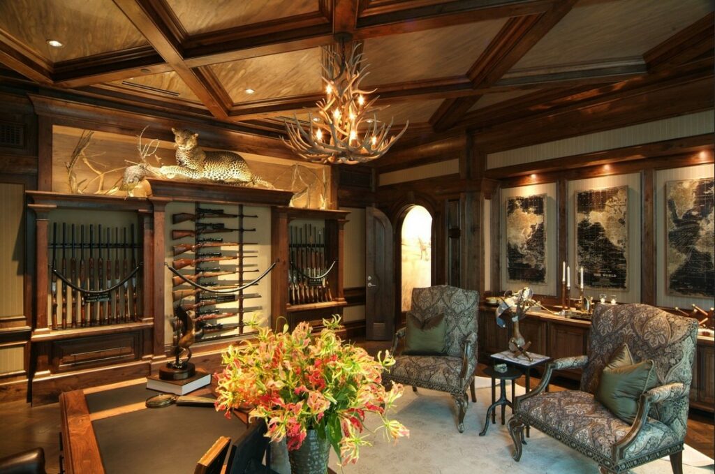
Add a decent cleaning station / workbench, and I think you can all see where I’m going with this one.

Of course, someone might say that this would not be a place where I could entertain my friends — but clearly, you don’t know my friends.

Whatever alternative use you can dream up for that room, you can be sure that you’d get more enjoyment out of it than can be had from a screening of Fast & Furious 207  or whatever other childish comic-book action comes out of Hollyweird.
Wallpaper

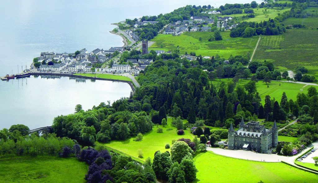
This is my current screen backdrop.  It’s the Scottish town of Inverary, with its castle in the foreground. (right-click to embiggen)

It will come as some surprise, perhaps, to learn that because of the whole hereditary thing, some childlessness and tangled family trees, the current (and next) Duke of Argyll is South African.

Johnny Not-So English

Mr. Bean has created a stir:

Rowan Atkinson has reportedly finally moved into his ‘space age petrol station’ mansion after a decade-long planning row with neighbours. The Blackadder star, 67, initially bought the 1930s quaint English home – known as Handsmooth House – and its 16 acres of land for £2.6million in 2006.

He shocked locals in the charming seventh century village of Ipsden in Oxfordshire when he knocked it down and installed a modern 8,000 sq. ft. glass and steel mansion designed by top U.S. architect Richard Meier in its place.

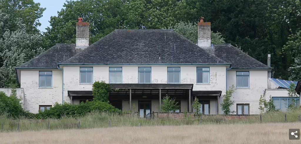
Oy.  From this:

…to this:

Now I’ll grant you that House #1 needed a lot of restoration.  And I’ll also grant you that House #2 is located where nobody can see it (at least from the road).

But seriously?

I note, by the way, that he has ample space to park his supercar collection:

Small wonder that it took him ten years to get permission to build this dropping of visual excrement.  It should have taken longer.

And One More Thing

After the British Virgin Islands were smacked by not one but two Cat 5 hurricanes in quick succession, most of the islands suffered massive property damage.

Since then, a lot of the wreckage has been rebuilt, and not to World Emperor Kim’s liking, either.  Try this little piece of heaven:

The caption for the pic was “Paradise restored”.

Paradise was not restored;  it was beaten to death with a lead pipe, driven over a few times by a Chieftain tank, and the remains wrapped in concrete and barbed wire.

Would it be wrong for me to wish for a Category 10 hurricane to come calling over there some time soon?

Swoopy

Following on from last night’s post, I happened on this little photo essay:

Eero Saarinen’s outlandish air terminal for TWA at New York’s JFK International Airport was sculpted as an abstract symbol of flight.

Now most Readers. knowing my abhorrence for Modernist architecture, would be forgiven for thinking that this post will be a diatribe against this building.  But on the contrary, I think it’s beautiful — for one thing, there aren’t any hideous straight lines and corners such as found in Bauhaus monstrosities.  As the writer of the article puts it:

Unlike most air terminals, which seemed intent on depressing passengers, Saarinen’s not only raised the spirits but also showed that concrete structures could be truly delightful.

And it is.  In the time it was built, I would imagine that its space-age, swoopy shape would be very much in keeping with the age of early space travel of the late 1950s and early 60s.  As the designer himself put it:

“…the architecture itself would express the drama and excitement of travel… shapes deliberately chosen in order to emphasize an upward-soaring quality of line.”

The first tragedy is that Saarinen died the year before his creation was finished.

The second tragedy is that the beautiful building has of course been “modernized” to make it “more efficient”.

Ugh.

There’ll be a parallel essay to this topic on Saturday.