Getting Happy

According to the NY Post, “buying time” can be the secret to happiness. Sarah Hoyt questions their methodology, as do I. Here’s the study’s methodology:

In the study, more than 6,000 people in four countries were given an extra $40 a week for two weeks.
During the first week, the participants were told to buy material goods.
The next week, they were told to save themselves time by paying someone to do their menial, back-breaking tasks.
Ultimately, people said they got more happiness by saving precious time than by buying more stuff, no matter how exceptional it was.

If anyone can think that $40 a week can buy you happiness, they’re doomed to vote Democrat and/or Labour for the rest of their lives. Hell, for $40 you can’t even buy someone’s time to do menial jobs for you, unless you live in India or some other Third World hellhole where labor is cheap. And unless you live in one of the aforementioned hellholes where $40 can buy you someone’s firstborn, you can’t buy much for a lousy forty bucks either. Good grief, a bottle of decent single malt costs more than that, and that won’t last you a week either (if you consume the lovely stuff like Stephen Green or I do).

Most often, the “money can’t buy you happiness” meme is applied to lottery winnings. The usual rejoinder is, “If you can’t buy happiness with $100 million, you just don’t know where to shop” (as witnessed by this picture, sent to me by Reader OldTexan):

But the idea of buying time when you have a boatload of money makes perfect sense, if you have sufficient money. Here’s an example, using the more appropriate sum of $100 million instead of that $40 rounding error.

So you’ve won the Big Lottery. Assume that you’re not going to waste it (on stuff like trust funds for your kids or donations to Greenpeace), and you decide to buy time with it.

Let’s say that you’ve always wanted to own an E-type Jaguar, because if no less a man than Enzo Ferrari called it the most beautiful car ever made, who are you to argue with him? A quick reminder of what we’re talking about here:

Nigella Lawson with wheels.

Now you have the money to afford it; but there’s a problem. You see, beauty doesn’t offset the E-type’s many flaws, to whit:

…which means that the thing often won’t start, the lights won’t work at night and ditto the windshield wipers when it rains, etc. Now if you’re one of those guys who loves working on cars, none of this matters, because you’re going to spend time fiddling with the thing.

Note that I said, “spend time”. If you’re like me, and want to drive the thing instead of fiddling with it and/or wasting time while other people fiddle with it, you’re not gonna get an E-type.

Fortunately, there is a way for people with boatloads of money to get an E-type and be able to drive it pretty much all the time. It’s an outfit in Britishland called Eagle Great Britain, and they rebuild E-types using all the modern techniques and using modern materials which will eliminate the Jag’s problems. If you’re in a hurry, you can get one of their fully-reconditioned E-types and drive it off the lot. If you can’t find one you like (and unfortunately, this will cost you some time), they will hand-build your E-type to the original (or your own custom) specs. Here’s an example:

Suffice it to say that none other than Jeremy Clarkson said that driving this particular E-type was one of the greatest driving experiences he’d ever had — and he’s had a lot.

I’m not to going to tell you the price, because you have enough. (BIG lottery win, remember?)

Just remember, this is all about buying time (which makes one happy, according to the study above) and I would suggest that time spent driving this piece of automotive beauty would be more exciting (and probably less expensive, ask Charles Saatchi) than driving Nigella Lawson. And that’s a hell of a thing for me to say.

Buying happiness just means knowing where to shop. And if you’ve just won a big lottery prize and owning an E-type is your dream, I’ve just told you where to shop for one.

You’re welcome.

Missing The Point(s)

Apparently all these women are desirable, according to scientists, because their figures have the ideal waist-to-hips ratio:

…which only proves that scientists don’t know diddly. None of the women can be called attractive.

Here’s a pro tip from a longtime lecher (that would be me): put Nigella Lawson in the lineup, and those other women wouldn’t rate a single look.

The perfect ratio is: big boobs, small waist, wide hips. Otherwise known as an “hourglass” figure, you pencil-pushing dweebs.

Afterthought: I bet that some of these purported “scientists” were female — which would explain everything.


Not Your Normal Portraits

If you’ve ever wandered through the Louvre in Paris or through any of the great houses in Britain, you’d have come across portraits of royalty and the nobility and good grief, how boring they are. Most, of course, were painted in times when there were no photography, and to preserve any memory at all of King Louis the Umpteenth or His Grace The Duke of  Marmalade-Hyphen-Dogsbottom, a portrait artist was summoned and told, “Paint me.” Needless to say, of course, the painter would take great pains to hide His Majesty’s facial pox marks or the Earl’s syphilis sores, and the result was one of uniform blandness, generations and generations upon generations thereof. If the painter was really good, and not just some fashionable hack that all the Society Knobs were using at the time (yes, that happened then just as it does today), he’d maybe capture a spark of spirit in the eyes, or a dimple in a smile, but mostly they all looked like waxwork figures, with about as much life.

Then came Boldini.

Giovanni Boldini is definitely my favorite portraitist of all time, and indeed he’s in my top ten list of all artists, period. I’m not going to write a potted biography of the man (here’s a decent one on the website bearing his name); rather, I want to highlight just a few of my favorites of his works.

When heiress Consuelo Vanderbilt married the 9th Duke of Marlborough in 1895, one of the things she brought to the marriage, other than a gazillion of her father’s dollars, was a very American attitude towards one’s own children. In contrast to the other noble families of the time, who looked on their male children as “heirs and spares” and wasted no time in shipping them off to boarding school, thence to the Army/Navy or public service, Consuelo adored both her sons, and especially the younger, Ivor Spencer-Churchill.

Enter Boldini. By this time, he was one of the most sought-after portraitists in Europe — indeed, he made so much money through his portraits that in his later years he’d quit painting them and only painted what he wanted to paint (which we’ll look at down the page). Boldini spent some time with Lady Marlborough, and discovered the close relationship between her and her younger son. Then he painted this portrait of the two of them:

The portrait actually scandalized what was known then as “polite” society (even though it was anything but), because instead of having young Ivor standing stiffly at her side in the prevailing fashion, he had the boy lounging against his mother in a pose which, to the swells, looked more like that of a lover than a child, nestled up to her bosom and his hand possessively on her leg. Of course, Consuelo cared not a fig for the whispers — as one of the wealthiest women in the world, and married into one of the oldest and most storied noble families in Britain (or anywhere else) withal, she could tell them all to take a hike, and she did. So the portrait survives to this day at Blenheim Palace, and you can see it for yourself if you do one of the tours (unless the painting is being exhibited elsewhere). I think it’s absolutely incredible: Boldini captured the relationship between mother and son as well as Consuelo’s considerable beauty and elegance, and it remains one of the great family portraits of all time.

Even Boldini’s “ordinary” portraits are anything but. Here’s one of Lady Colin Campbell, a society beauty of the late nineteenth century:

…and I don’t know if there’s a sultrier, sexier portrait of its kind anywhere.

As I said, Boldini gave up portrait painting after a while and started to do works that interested him. Mostly, as his biography notes, they were of women — but instead of the realistic style of the portraits, they began to lean towards late Impressionism. (Whether that’s because of his failing eyesight or just because he liked the style is probably a moot issue. Myself, I love almost every one of his later works.) Here’s a sample. First, the “Spanish Dancer At The Moulin Rouge”:

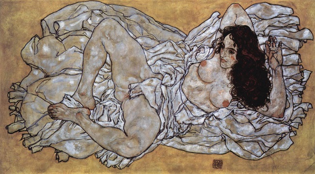
Now let’s look at something a little (okay, a lot) racier, his “Reclining Nude III”:

Hmmm… maybe I should have put up the usual NSFW warning, but hey, it’s Saturday and you shouldn’t be at work anyway. Finally, here’s my favorite of all Boldini’s paintings, an earlier one entitled “The Hammock”:

In a word, it’s exquisite: the soft springtime lighting and the dense background of bushes, trees and flowers which surround the slight form of the girl sleeping in the hammock. It’s a view which is chaste (the long soft material conceals almost everything except her face) and yet intimate (the stockinged leg falling carelessly off the hammock and out from under the dress). It’s voyeuristic, but innocently so — and I think if Boldini had only ever painted this single work, it would still be considered a masterpiece.

Now you can go and look at his other works, here. No doubt you’ll find one or two that you prefer over my choices, and you won’t hear a word of disagreement from me, ever. That’s how highly I regard this artist.

Enjoy, and if you want to buy a print of one of Boldini’s works (on canvas or paper, in varying sizes), you can do so at the Art Renewal Museum.


Insisting On Beauty

One of our favorite famille du Toit sayings is: “Architecture doesn’t have to suck.” And that’s because most often, it costs pretty much the same to build a beautiful building as it does an ugly one. (Yeah, sometimes the flourishes and carvings might make it a tad more expensive, but — to use another favorite family saying — “Long after you’ve forgotten how much it originally cost, you’ll still be appreciating its beauty.”) This article, I think, makes a good case for why beauty should be maintained, nay even required, in its examination of why beautiful architecture is so necessary.

My favorite distinction is between the Art Nouveau and the Le Corbusier (a.k.a. Modernist) styles:


Myself, I prefer the graceful, almost decadent style of Art Nouveau, and find the sterile straight lines and sharp corners of Modernism (or what I call the “East German”) style repulsive and soul-destroying. It should come as no surprise that the first style came about before the First World War, and the second style immediately thereafter — just like the exquisite art of Impressionism was followed by Cubism [50,000-word anti-Cubism rant deleted].

Yes, I know that Modernist buildings are more “efficient” (like that’s important) in their ease of construction and utilization of space. All I know is that I’d rather look down any classical Parisian street than any modern German one. (Or, for that matter, a street in an American city like Dallas, which is so ugly it’s small wonder that most North Texans prefer to live in the suburbs, which are themselves hardly a source of exemplary architecture.) And I can say with absolute certainty that I’d rather live on a beautiful Art Nouveau street than on one lined with buildings designed by Walter Gropius (another architect who — like Le Corbusier — should be in a space where the temperature is set to “Broil”).

I know, I know: beauty is in the eye of the beholder. But as Joseph Campbell is quoted in the linked article above: “If you want to see what a society really believes in, look at what the biggest buildings on the horizon are dedicated to.”

We should live amidst beautiful things, we should strive for beauty even though some evil bastards may call it “decadent”.

A rose is beautiful, and it decays and dies. A concrete block is useful, and survives for centuries, its ugliness almost timeless. No two roses are alike; all concrete blocks are identical. We can always grow another rose to replace a dead one — but to get rid of a concrete block, we need jackhammers and high explosives.

I know that some people may find beauty in straight lines, and sharp corners, and orderliness. I’m just not one of them.

Holiday Cars

I’m using the word “holiday” in its universal sense, not in the American one (which refers to “holy days” because we’re too literal). I’m doing that because “we’re going on holiday” sounds more cheerful than “we’re taking a vacation”, and this is a cheerful post.

So you arrive at your holiday destination at some excellent beachside place (Cannes, Cabo, Caymans, whatever) and decide that you want to do a little exploring of the town, the area, whatever. Assuming that you’ve flown in and not driven, how are you going to get around?

Well, that depends. If you’re in the Greek Islands or somewhere thereabouts, you’ll either rent bicycles (ugh… way too much hard work) or one of the near-ubiquitous Vespa scooters (fun but dangerous, even if you are, as writer George Mikes once described it, walking sitting down).

The problem is that both bicycles and scooters are pretty much single-seater conveyances — yeah, the Vespa nominally has two seats, but on anything other than downhill you’ll be traveling at slower than walking pace (especially if like me you are a Fat American and therefore, statistically, your companion will also be a Fat American). Really, if you aren’t traveling solo, a single-seater isn’t an ideal option. So you want a car; but yuck, you’re in some sun-bleached paradise, so you want to be en plein air (if you’ll excuse my French) rather than in a small rental econobox with, most likely, no air-conditioning.

What to do?

Unfortunately, now that Foul Government has stuck its safety-first fat nose into all our fun activities, our options are limited because what was fun and available in the 1960s, for example, is now streng verboten (yeah, sounds better in the original German, doesn’t it?) and I’m going to suggest at this point that we may be safer nowadays, but we’re the poorer for it.

What am I talking about? I’m talking, of course, about little open-air runarounds like the VW Thing, the Austin Mini-Moke, and the Fiat Jolly, all of which can still be found, but sadly in ever-shrinking numbers. Pound for pound (and dollar for dollar), these little things probably offer more fun and excitement than any other car ever made. Here they are, in the same order:


Now at this point, of course, the Safety Nazis are reaching for the smelling salts because OMG no seatbelts! no roll bars! no doors! wicker seats? and all the usual crap that the PC Crowd like to throw around when telling us how to behave For Our Own Good. And yeah, I know they’re unsafe, by any standards let alone today’s. But I have to ask myself (and I have absolutely no data to back this up): did people die in their thousands from driving these wonderful little buggies around in the manner intended? I sincerely doubt it. If driven around at 20-30 mph around seaside towns and villages (i.e. as they were most of the time), I bet the total “death toll” in the 1960s would have been measured in single digits, if there were any deaths at all.

Imagine what the Safety Nazis would think when seeing this little sight:

They’d probably have a collective heart attack. Which would be a Good Thing. (I would too, just for different reasons.) And let’s not even talk about the decorations one could add to these lovely little runabouts:

No wonder they’re banned. That’s Way Too Much Fun for our modern-day Puritans.


Afterthought: I know some crowd called “Jollycars” is retrofitting the new Fiat 500 into a modern equivalent of the Jolly:

…complete with either canvas seats or wicker ones. Problem is, these cars are selling for $85,000 — or, the cost of a new Alfa Romeo Giulia Quadrifoglio.

No comment.


Cover Art, Journeyman Artist

Normally, when I do a profile like this, I do a short biography and some background of the subject… but there are times when I just want to shut up and let the man’s work do the talking.

This is especially true of Robert McGinnis, whose work is as popular with ordinary people as with book editors and publishing houses. I have to tell you, this is an artist of exceptional talent — yeah, he doesn’t do “fine” art, but I have to tell you, his art is just fine by me.

If like me you’ve read many paperback novels, McGinniss’s work will probably be familiar to you; and even if you haven’t, his style will be instantly recognizable. If you look for “journeyman artist” in a dictionary, it will be his face right there under the entry title.  Here are a few examples:


…and I know, I’m going to hear mutters of “graphic art, not fine art”. Yeah, I know: he’s no Boldini (whom we will be examining later this month). But just because McGinniss has earned his living with the above kind of work, it doesn’t mean that he’s incapable of a different class of art — like this one:

And then there’s this one, in which you can almost taste the dust:

…and this one, full of menace (can you spot it?):

I can hear the cries now: “Oh, Kim! Cowboy art? My smelling salts!”

Honestly, I think McGinnis’s work transcends style and trend: they are simply pictures which tell a story; sometimes you have to look for it, and sometimes it’s quite obvious. One more, for luck:

Yeah, it’s James Bond. Why not James Bond?

McGinnis is still alive, and he’s still painting, I think.  Go ahead and google his name if you want to see more of his work. It will take you a while to get through it all, but hey: it’s Sunday.